
The fireworks marked the middle of Christmas holidays for the children, but, as Caroline sighed, after the 1st, there's really only reading to do before school starts again. During Christmas we had a fantastic time as usual in Switzerland with my sister, where we managed to sneak in skiing despite the warm weather. Hope everyone else had a good holiday, and I'm glad to be back for the new year!

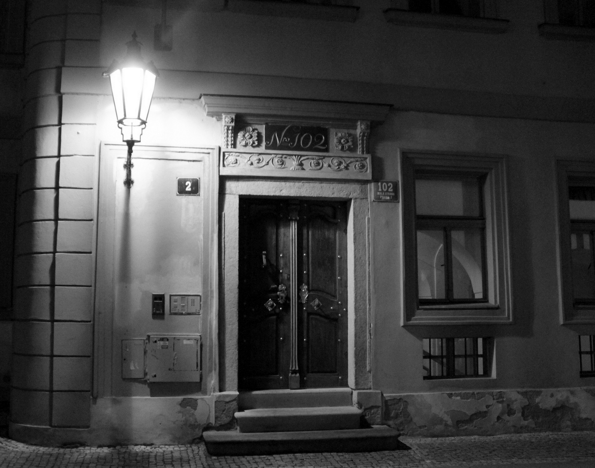
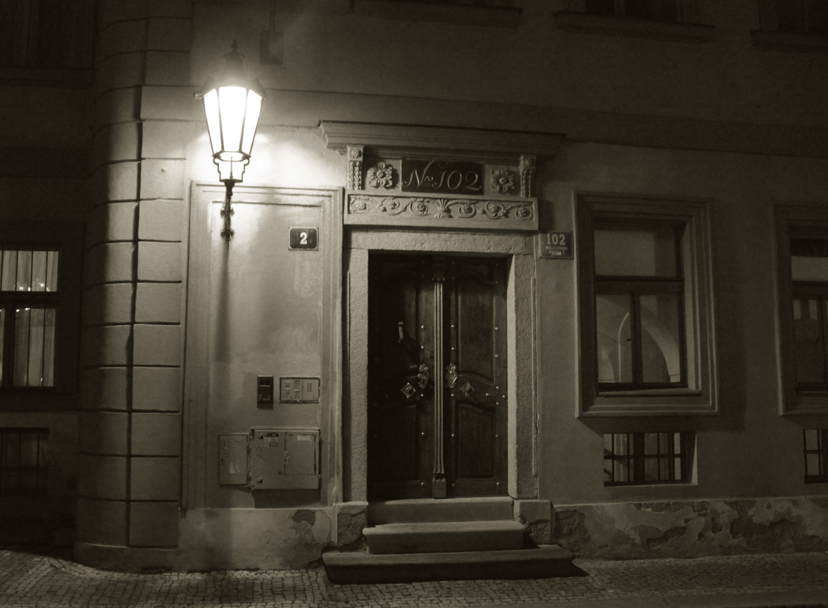
Thanks to Tommy, I've learned something new today! Here's a third version of the picture with a duotone added to it and curves slightly adjusted.
As usual, if you click a picture, you'll see a full size version.

14 comments:
I always prefer the black and white.
Sounds like you had a great holiday break!
Well, I can't decide which is better, like them both.
Me? Sick all through the holidays. Yup.
When I run into situations like this, I look at the color version and see if what I like is a particular color, or possibly color pair, and then I use those color(s) to tone the black and white image. If I have a color pair, I'll use one for the highlights and one for the shadows. It's surprising how well that works and how subtle the toning can be to get the feel of the color photo across.
Lightroom (and Adobe Camera Raw in Photoshop) makes this very easy to do.
I so often like the color version better. Am always surprised at myself. (Is it due to too many grey days?)
Oh, they're all lovely , each with a different mood. I'd love to figure out how to do that third version! I suppose I need that Camera Raw plugin. Will that work on regular PhotoShop images or must they be Raw photos? An artist friend of mine bought an expensive plugin that converts PhotoShop colour photos to various optional shades of duotones, like this.
GG- the holidays were wonderful, then, like Paola, we all caught colds.
Paola - hope you're already on the mend!
Tommy - I truly appreciate it, and have decided that I need to explore tones more.
Ellen - I usually like color better as well, but the yellow was very blown out in the color version, and I like the way the more monochromatic scheme pulls out the shadows here.
ML - I don't have the Camera Raw plugin. What I did was to change the image in IMAGE > MODE > Black and White, then IMAGE > MODE > Duotone. From there, I set two colors - one for highlights and one for shadows, and I adjusted the curves for the shadows so that my highlights weren't too blown out. Later versions of Photoshop apparently have handy palettes you can apply, but mine does not, so I adjusted everything by trial and error.
Bonne année!
I like the BW and dual tone photos best :)
Thanks for the tips! I tried it out but I think my version of PhotoShop is different in that I could not choose highlights and shadows... or most likely I'm not doing it right. I'll try it again tomorrow.
A bit too subtle for my dimming eyes. But for colour of a metaphorical sort you could sneak out some late evening or early morning and attach a carefully lettered poster to that door: Ministry Of The Interior, Kock And Wait.
That's "Knock". Or, come to think of it...
Happy New Year!
The duotone shot keeps the warmth of the door. I like that. I am also intrigued by the bright lights in the window to the left. Happy little lights in the shadows.
I never actually take pictures in b/w, I expect I could but have never tried to find out, since even with dopey old Picasa they can easily be rendered b/w later.(My PS went down with our old computer and I've never bothered reinstalling it on this one, too fussy and difficult, I can't cope with the embarrassment of choice of things I know how to do, never mind learning all the ones I don't!) Is there a difference? I remember somebody (probably BB/LdP/RR come to think) quibbling about whether something was 'real' b/w or Photoshopped.
I often like b/w, but feel kind of self-conscious about it, as though I'm doing something to get a rather disingenuous retro effect, likewise and more so with sepia. I like all three of these of yours.
Happy New Year to you all!
I love the soft glow of the colour one. Not that the other two aren't beautiful too ...
Beautiful photograph. I found your blog while looking for a translation of the Skacel poem about wings of beech wood. Have you done any other translations of his work? That one was lovely.
Post a Comment